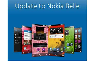
Symbian Belle - sorry, 'Nokia Belle', Feature Pack 2 has been available
now for a few weeks and it's time to take stock. How many steps forward
did this take the OS? And how many steps back? What's in Belle FP2 and
how does it compare to other smartphone user interfaces in 2012?
Before I start, a few disclaimers:
Not every feature mentioned in this feature is available on every smartphone. I'm using the Nokia 808, but much will also be relevant to the Nokia 701, 700 and 603.
None of this is directly relevant to older Symbian smartphones (just cutting off the inevitable beginner comments complaining that their N8 hasn't got Belle FP2 yet....)
Background (2006 to present day)
It's worth noting where Belle FP2 fits into the Symbian timeline. OK, yes, at the very end, but it's instructive to look back and gather some historical perspective. It's often quoted that Belle FP1 is the same as what was once called Symbian 'Carla' and that FP2 is what was once called 'Donna', but this is simplifying things way too much - when those projects were first proposed within Symbian and Nokia, their contents were different to what emerged as updates in the real world. Which is to be expected. So I'll stick to the published OS update names here.
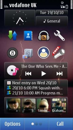
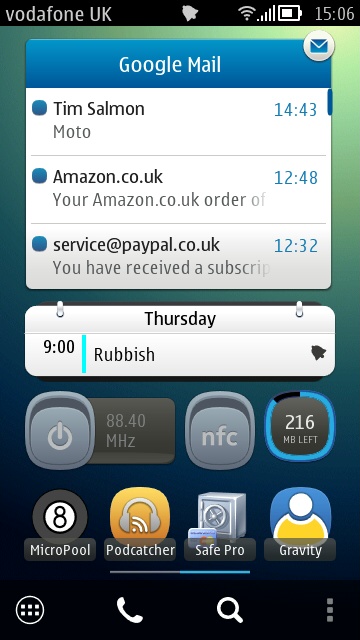
The original Symbian^3 homescreen, lifted from my Nokia N8 in 2010 (left); on the right, my homescreen on my Nokia 808 in 2012
S60 3rd Edition (including FP1, FP2) - the vast range of non-touch, pre-2009 (mainly) QVGA smartphones - I won't got into detail here, but there's 100,000 words of content about these devices and their software scattered here around AAS. Hero devices: Nokia N95, Nokia E71, Nokia N86, Nokia E90.
S60 5th Edition (December 2008) - Nokia's first cut at adapting S60 to a full-face touchscreen interface. The transformation worked but was inelegant in terms of an optimised UI. Most generic S60 3rd Edition applications could be used or adapted easily. A step forwards but an ugly one and the use of resistive screens on most of the devices was clumsy in a world getting used to a popular Apple iPhone. Hero devices: Nokia 5800, Nokia X6, Samsung i8910 HD, Nokia N97 mini.
Symbian^3 (September 2010) - came out on the next generation of Nokia hardware, including full graphics acceleration, making possible really decent games and effects. There were some optimisations for touch over S60 5th Edition, plus two extra homescreens, and automatic text correction in the built-in landscape QWERTY virtual keyboard. Hero devices: Nokia N8, Nokia C7.
Symbian Anna (August 2011) - came out on the Nokia E6 and X7, plus a huge update for existing Symbian^3 generation devices, bringing portrait mode QWERTY, split-screen entry, a much better Web browser and interface, whole new icon set, smooth homescreen swiping, big updates to Photos, Camera, Mail, Social, and more, NFC activated on the Nokia C7. Hero device: Nokia E6.
Belle (October 2011) - came out on the Nokia 700, 603 and 701, plus a huge update for existing Symbian^3 generation devices, bringing a major reworking of the user interface, with an emphasis on ease of use and flatter navigation hierarchy, a new RAM management scheme, full NFC 'tap to ...' functionality (where supported by the hardware), variable-sized widgets, up to six homescreens, a drop-down notifications and settings pane, a 'flat' application launcher by default, big facelifts for Camera and Music player. Hero device: Nokia 701.
Belle FP1 (April 2012) - came out on the Nokia 808 PureView, plus an update for the Nokia 700, 603 and 701, bringing an increase in the clock speed of the Nokia 701 and 700 from 1GHz to 1.3GHz, a raft of new homescreen widgets and toggles, the introduction of Dolby Headphone and Dolby Digital Plus functionality where appropriate. Hero device: (obviously!) Nokia 808 PureView.
Belle Refresh (August 2012) - an update for much of the Symbian^3/Anna/Belle generation, though rollout is still patchy. Brings many widgets, application updates and optimisations.
Belle FP2 (October 2012) - an update for the Nokia 700/701/808 generation, still rolling out as this article is written and covered in detail below, bringing many application updates, multi-touch in the virtual qwerty keyboards, cosmetic changes, music player control from the notification bar, more widgets, and additional functionality for the Nokia 808.
Belle FP2 as we head into 2013
It's instructive to take stock of the state of Symbian as we finish 2012, in the light of the rest of the smartphone industry. Once upon a time (2006), Symbian was the smartphone world, with market share frequently quoted around 60% or more. Since then we've had the Apple iPhone (2007), with iOS gradually improving year on year, plus Android (2008), improving just as fast, and Windows Phone (2010), currently in the middle of a big step change up to Windows Phone 8. What all of these mobile OS have in common is that they're designed from the ground up for full-face touchscreen devices and that there's an emphasis on a slick user experience.
Symbian came from a world where the main thing was providing functionality - this was a world where almost every function was new and remarkable (camera, navigation, stereo music, web browsing, and much more) and Nokia in particular was a company that was engineering-focussed, so speed of interface and whizzy effects were nearly always sidelined in favour of (for example) better battery life. In contrast, modern 2012 devices are assumed to be plugged into a charger every single day, screens can be enormous and processor speeds and interface software can be allowed to run at insane speeds.
The approaches are very different and it's not surprising that Symbian and Nokia struggled to make the switch to be in line with 2012 smartphone expectations. The very fact that it's taken over four years for Symbian's virtual keyboard to support multitouch (i.e. you can press one virtual key before another finger has lifted from the previous one) is testament to how hard changing some of the deep-seated components in the OS has been. Even now, we've got something of a patchwork quilt of a smartphone OS.
Belle FP2 is much more than papering over the cracks of a legacy operating system being stretched in ways that its initial designers never intended, but you get the idea. Even today on the Nokia 808 PureView with Belle FP2, there are oddities. Here are a few that come to mind:
the notification LED not working for emails
no email mentions in the drop-down notification pane
an inconsistency about which keyboard pops up in which application and in what mode
a limitation to only one Mail for Exchange account and only syncing one calendar
built-in social networking support that's based on web browser components, along with all the overhead this brings
an application installation system that's horribly intrusive (Qt apps essentially lock out the Store client and installer for a good minute, even for installing a trivially small utility)
various wi-fi connection and video streaming bugs
web browsing is still slower than on similar Android or iOS devices, especially on javascript-heavy sites
two Office suites are provided, one legacy (Quickoffice) and one cloud-centric (Microsoft Office), yet neither are particularly fast or pleasant to use
selected Belle FP1 applications no longer work and at this late stage in Symbian's development there's a question mark hanging over whether some of these apps will get updated at all
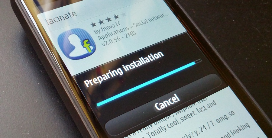
I could go on - I'm sure you can add your own gripes to the list above! What we do have is an operating system that's still more battery efficient than most of the competition - my Nokia 808 PureView regularly goes two days on a single charge, we have a proper multitasking OS that allows, emails, social updates, podcasts, all to be gathered in the background so that the speed of the device almost becomes irrelevant - I switch to the appropriate application and everything's there waiting for me. No need to wait or press 'refresh' and then wait some more or sit there watching dots fly across the screen, as on some other mobile OS I could mention(!)
Astute observers of the comments threads on all our update stories here on AAS (some of which are linked above) will notice that there are always a few gotchas, a few steps backwards to accompany each brace of steps forward with Symbian. It's something we've come to expect, not least because every change (in the name of modernisation) is bound to annoy people who were happy with the previous version.
It's even a valid question to ask whether in fact Belle FP2 is the best version of Symbian OS yet - I know a fair few Nokia E6 owners who were much happer with the more d-pad focussed Symbian Anna and who were mightily upset by the switch to Belle. Or the Nokia 701 owners who found the rewritten Photos application (put in place because of the 808's needs) annoyingly cut down from the version in Belle FP1. But, despite a few minor upsets along the way, simply having the latest versions of Web and Email and the video codecs, and so on, having the smoothest performance, having the sleekest camera UI, are all worth having and I'd always recommend that people upgrade to the latest version of firmware offered - for every one annoyance there will be two more things which either delight or work better under the hood.
In short, Belle FP2 is well worth having and in the sections below, I explore what's new, what's good and, in some cases, what's frustrating.
Belle FP2 in detail
Here's the full changelog from Nokia Belle Feature Pack 1 to Feature Pack 2:- Swipe to Unlock shade effect for lockscreen (shown below), plus swiping on message notifications opens up Messaging directly
- New staggered keyboard layout with word predictions presented in real time above the keyboard and now supporting multitouch
- New version of Web, (v8.3.2.21)
- Support for voice search in Maps, simply say the place or thing you're looking for(!)
- 808s which had their 'Search' engine permanently set to 'Bing' can now choose 'Google' as well
- New email widget, showing one message at a time
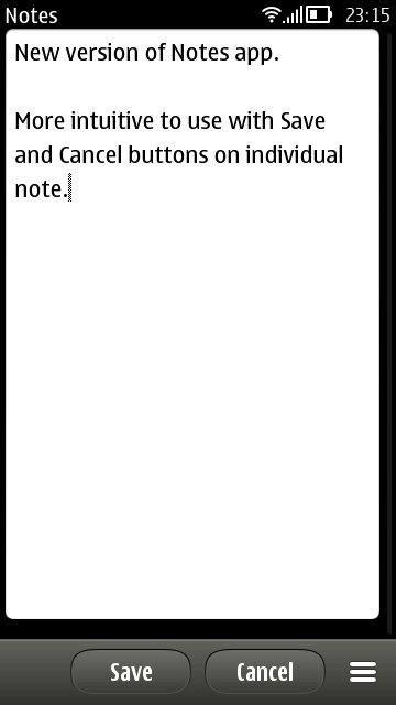
- Other new widgets, e.g. Notes, most of which we've seen before in Belle Refresh for older Symbian^3 generation devices
- Refreshed Music player (v17.3.18), with artists and other tabs in a facelifted UI
- Music player pause/play icon in the notification bar music panel
- Lighter colour schemes by default
- Many transparent toolbars throughout the UI, letting the screen content partially show through
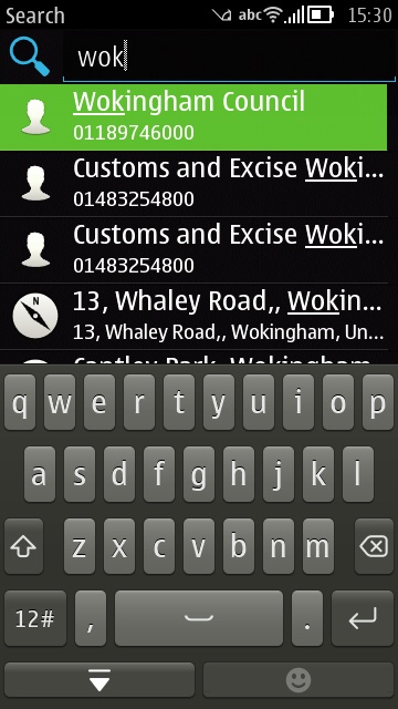
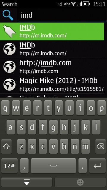
- Homescreen toolbar has added universal search icon
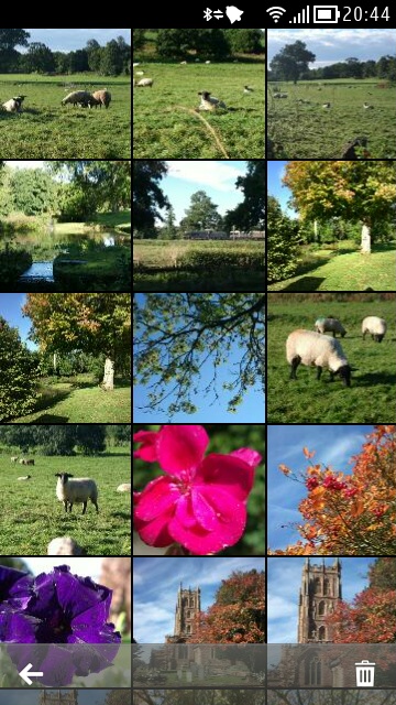
- Gallery changes - now works fully in landscape mode, ALL photo details available in a detailed info pane (right down to including the exposure histogram for that shot!), multiple photo selection for deleting now possible, through a new trash can icon on the toolbar
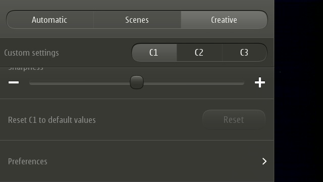
- New reset button in Creative mode to change all the settings back to default with a single touch
- Nokia Car Mode built in
In addition, the very existence of Feature Pack 2 means that a couple of other application updates are needed (via SW update on the device):
Microsoft Apps 2.1 (build 2.1.5616)
Nokia Social 1.6 (build 1.6.32, bringing 'new widgets, an enhanced user experience and feature updates', replaces v1.5.233, which was in the standard Belle FP1 firmware)
Add it all up and Belle FP2 is a pretty significant update - in the case of the Nokia 808 PureView, it transforms it from an awkward camera-centric phone ("What, no multitouch input? What, no way to mass delete images and videos?") into a much more useable 2012 smartphone. Critics of Symbian will still maintain that the OS isn't useable, but I suspect that such writers are still thinking of their old N8 with launch firmware or (shudder) their experiences with S60 5th Edition on the Nokia 5800 and N97. Much as I loved the latter two devices as a Symbian geek, I can see how the resistive screen, scroll and select UI paradigm, and scarcity of system disk space and RAM would all appear pretty unusable to someone used to an iPhone or Android phone in 2012.
Which is very unfair, since Symbian (as detailed above) OS and its user interface have gone through at least four major versions since the days of the 5800/N97. Slamming Belle FP2 on the Nokia 808 (or 701) is a bit like me comparing the 808 to an original iPhone and complaining that it had no support for applications.
Homescreen and launcher
Starting from the lockscreen (shown above), which shows text notifications, missed calls, and so on (though not emails), being able to swipe at any angle left or right, from any position on the screen, is a nice touch and is much more flexible than having to perform a specific gesture at a specific location, as on (for example) the iPhone or most Android phones. Having said that, the sprung (hardware) keylock toggle button on the side of the Nokia 808/701 etc. is even more convenient, so in practice most users may never even see the lockscreen, somewhat ironically(!)
With the extra batch of widgets added for Belle FP1 and FP2, Symbian now has, built-in, just as many homescreen gadgets as most Android phones. From clocks to weather to connectivity toggles to a data counter to application shortcuts to email and calendar views to music playback, Belle FP2 now has pretty much most use cases covered here. There aren't a huge number of third party widgets (maybe less than fifty in total), but I for one am very happy with the current selection.
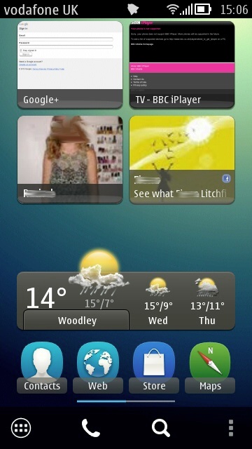
With the N8 on Symbian^3, I famously liked to keep my homescreen very simple, just the one page, so that everything was to hand. On the Nokia 808 with Belle FP2, I've branched out slightly - after many rounds of trial and error in day to day use, I've ended up with two homescreens, shown below - between them they do give a good flavour of the sort of flexibility available in Symbian as of late 2012:
Add it all up and Belle FP2 is a pretty significant update - in the case of the Nokia 808 PureView, it transforms it from an awkward camera-centric phone ("What, no multitouch input? What, no way to mass delete images and videos?") into a much more useable 2012 smartphone. Critics of Symbian will still maintain that the OS isn't useable, but I suspect that such writers are still thinking of their old N8 with launch firmware or (shudder) their experiences with S60 5th Edition on the Nokia 5800 and N97. Much as I loved the latter two devices as a Symbian geek, I can see how the resistive screen, scroll and select UI paradigm, and scarcity of system disk space and RAM would all appear pretty unusable to someone used to an iPhone or Android phone in 2012.
Which is very unfair, since Symbian (as detailed above) OS and its user interface have gone through at least four major versions since the days of the 5800/N97. Slamming Belle FP2 on the Nokia 808 (or 701) is a bit like me comparing the 808 to an original iPhone and complaining that it had no support for applications.
Homescreen and launcher
Starting from the lockscreen (shown above), which shows text notifications, missed calls, and so on (though not emails), being able to swipe at any angle left or right, from any position on the screen, is a nice touch and is much more flexible than having to perform a specific gesture at a specific location, as on (for example) the iPhone or most Android phones. Having said that, the sprung (hardware) keylock toggle button on the side of the Nokia 808/701 etc. is even more convenient, so in practice most users may never even see the lockscreen, somewhat ironically(!)With the extra batch of widgets added for Belle FP1 and FP2, Symbian now has, built-in, just as many homescreen gadgets as most Android phones. From clocks to weather to connectivity toggles to a data counter to application shortcuts to email and calendar views to music playback, Belle FP2 now has pretty much most use cases covered here. There aren't a huge number of third party widgets (maybe less than fifty in total), but I for one am very happy with the current selection.
With the N8 on Symbian^3, I famously liked to keep my homescreen very simple, just the one page, so that everything was to hand. On the Nokia 808 with Belle FP2, I've branched out slightly - after many rounds of trial and error in day to day use, I've ended up with two homescreens, shown below - between them they do give a good flavour of the sort of flexibility available in Symbian as of late 2012:

Text entry
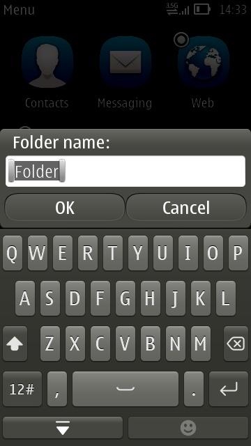
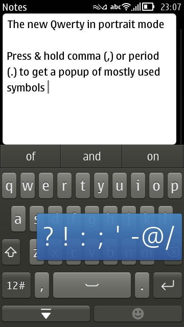
One of the most significant changes for Belle FP2 was the addition of a 'staggered' layout qwerty keyboard with multitouch. The old 'grid' keyboards are still there in the OS and brought up by some legacy applications, as indeed is the old 'numeric keypad' method of entry. As indeed is a brand new, rewritten numeric keypad. Gah - I said things were a little confusing under the hood in places!Staying with the QWERTY defaults though, the new keyboard is (as is typical for Symbian) two steps forward and one step backwards:
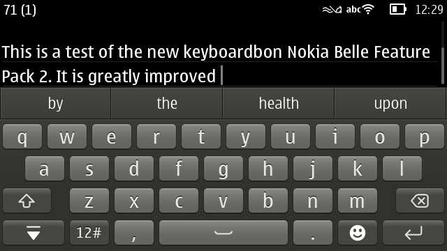
Such an omission can be argued to be a deliberate design decision ("People hate having their words corrected to something they didn't mean"), but in my view the vast majority of users will want (and expect) auto-correction, just as on iOS, Android and Windows Phone. A major disappointment, though surely something that can be easily fixed by Nokia in a software update/patch, if there's still the will and resources at Accenture.
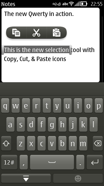
Also new for Belle FP2 is a refinement in selecting text and copying it to the system clipboard:
- Tap in editable text to position the cursor - once the cursor is placed (approximately), 'nudge' arrow keys (in blue and hard to screenshot here!) appear for a second or two, to allow more accurate placement if needed.
- Tap and drag to select text, which appears highlighted, along with start/end markers.
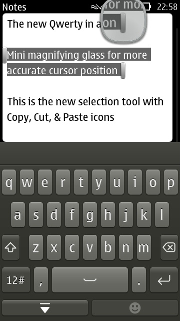
- Drag the end markers as needed, to further refine the selection - a magnifying glass helps here, by showing more closely exactly where the markers are going.
Web browsing
I can be accused here of being a little old-fashioned, but I rarely 'browse' web pages on my smartphone. If a link is passed to me via email or Twitter then I might choose to open it in Web and have a read, but 95% of online information comes to my Belle FP2 phone via clients: email, social, timetable, reference, and so on.However, web browsing is important to some and Symbian's Web is often accused of not being competitive enough. The 1.3GHz processor in the Belle FP1/FP2 devices should help here, but this OS update also includes a new version v8.3.2.21, with better performance and better HTML5 compatibility. In a quick and dirty benchmark, I tested loading times for my own site,stevelitchfield.com (low complexity), the full New York Times web site (average complexity), the BBC desktop site (average complexity) and the full CNN site (high complexity), on both the Nokia 808 PureView running Belle FP2 and the dual core Samsung Galaxy Nexus, running Android 4.1 (Jelly Bean):
| Sites/load times | Nokia 808 PureView with Belle FP2 browser | Galaxy Nexus with Android 4.1 |
| stevelitchfield.com | 10s | 3s |
| nytimes.com (full) | 27s | 11s |
| bbc.co.uk (desktop) | 12s | 3s |
| cnn.com (full site) | 43s | 16s |
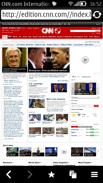
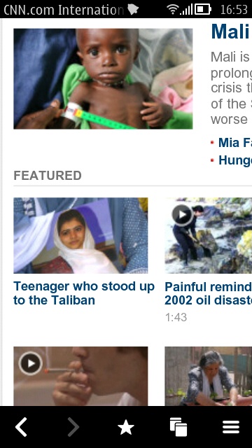
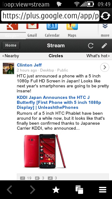
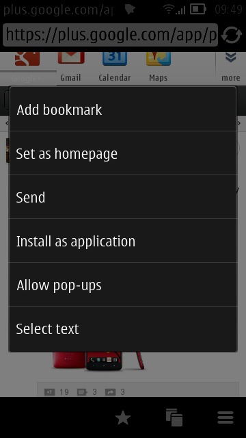
The results won't surprise anyone who's tried loading pages in Symbian Web in the last few years. Although the amount of HTML5 compatibility has risen massively (as shown below, and which is why you can use, for example, the Google+ site), the overall speed of rendering hasn't. Add this to the relatively low nHD screen resolution and it has to be said that you have to be something of a masochist to do a lot of web browsing on Symbian, even at Belle FP2.
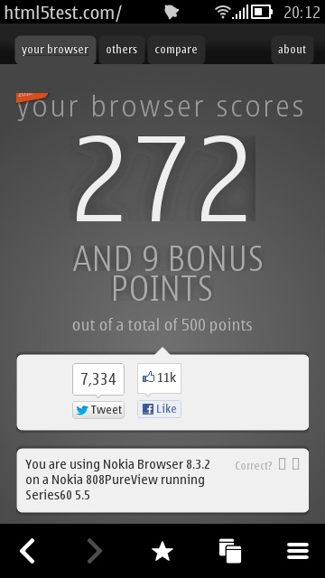
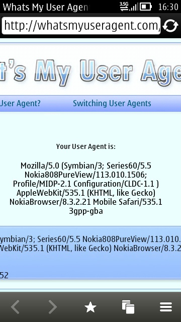
HTML5Test.Com scores 272 with 9 bonus points (it was 226 with 9 bonus points in Belle FP1). The user agent is Webkit 535.1
Social integration
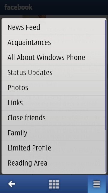
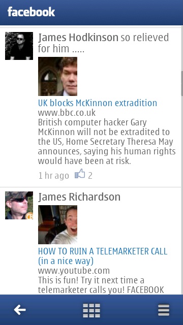
In theory, social integration into Symbian these days is excellent. Belle FP2 comes, as detailed above, with another new version of Nokia Social, with extra optimisations and wizards to sync contact thumbnails from social networks to matching contacts in your main address book on the phone. There's a traditional tabbed Twitter view, full support for uploading media, homescreen widgets, plus a rather comprehensive Facebook client with all the features a casual user might need. And it's all in the phone, for free - what's not to love?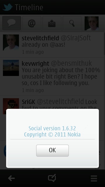
Car mode
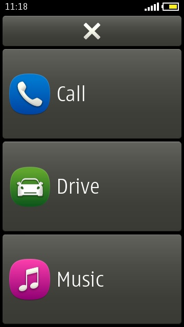
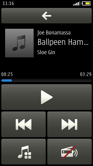
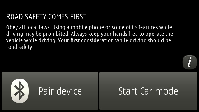
Already released for older devices and so not actually new, but it's good to see Nokia Car mode make it into device firmware. Offering just the core three functions shown (so sorry if you like replying to email one handed while on the road!), but they're well chosen and cater for what most people need while driving. The music module defaults to 'shuffle' mode, but you can change this as needed...As you can see from the screenshots, all functions are implemented with over-size buttons, making them easier to hit without taking your eyes off the road for too long. Very cool, and every smartphone should have something like this.
Camera tweaks
Also in Belle FP2 is a new Camera application - new, that is, to the Nokia 603, 700 and 701, since it's the guts of the Camera application that debuted with the Nokia 808 PureView. On the plus side, the interface is now more intuitive and you can launch the camera from a locked phone by pressing and holding the shutter button - on the minus side, there's no option in the new app to switch to the front camera - yet another example of the two steps forwards, one step back syndrome that has plagued Symbian in recent times.On the 808 PureView, down at the bottom of the Creative pane of settings, there's the extremely welcome option to reset any of the three custom presets to 'default values'. I was forever fiddling with something and forgetting to change it back, so this gets a big thumbs up from me.
And the rest
There's a lot more in terms of little tweaks and features, as per the
changelog above. Music player has received a facelift, with volume now
appearing as a top-of-screen blue gauge and only controllable via the
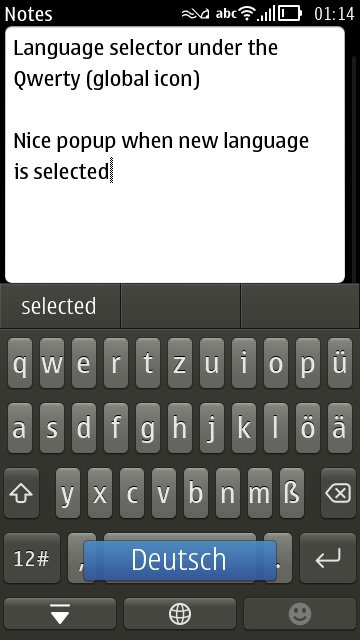
phone volume buttons. And it's now easy to change the input language on
the fly: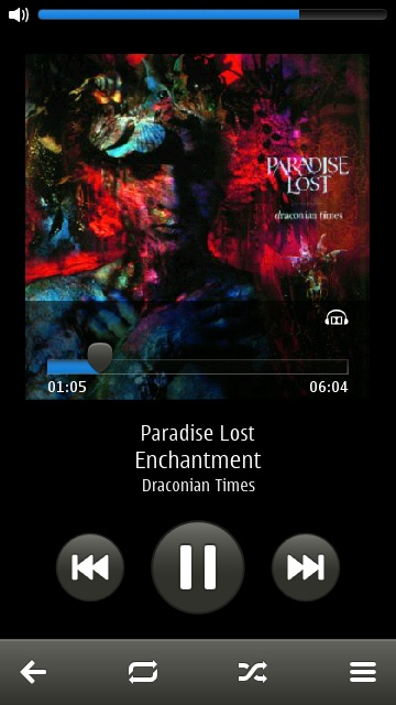
Verdict
Belle Feature Pack 2 is likely to be the very last major update to Symbian OS and it's a bit of a 'curate's egg' if I'm honest. I'm glad it's out, there are plenty of splendid features, but there are weak points to the whole OS that remain weak and there are silly bits missing (e.g. auto-correct in the keyboard) that really need patching via Sw_update sooner rather than later.Does Belle FP2 take Symbian to the same level as iOS, Android and Windows Phone in terms of user interface speed and fluidity? Sometimes. Is Symbian's UI a showstopper, a reason to not plump for a Symbian-powered phone like the Nokia 808 PureView in 2012? Absolutely not. The OS shows its age occasionally, but Belle FP2 is largely a smooth and pleasant experience, especially if you know what you're doing and you fill in some of the weak points with third party applications: Opera Mobile, Gravity and so on.
With the UI out of the way, your buying choice then comes down to whether you value Nokia's rather terrific hardware and gadgets over the admittedly limp state of its application ecosystem.
